One of the most essential documents any business can have is a visual identity guide, yet many don’t have one.
Why are these guides so important? They ensure brand consistency throughout any collateral you make–no matter who created it.
Visual identity guides contain all the necessary information to create whatever you company needs. Whether it be a website, advertisement, flyer, or whatever else, this little document will make your life a breeze. So, if these guides are so important, why doesn’t everyone have one?
The biggest reason is time. Visual identity guides don’t just magically appear. They take time and effort to create, and time is a precious thing. But think about it–how much time does it take to explain to a designer that they’re not supposed to change any of the colors of your logo? What about finding every font you used and having to relay that to them as well? Not to mention any iconography you’re using. Then when you hire a second designer since your business is booming, you’ll have to explain it all over again.
Do yourself a favor. Create a visual identity guide now (or let us do the work!) and save yourself a lot of time and frustration down the road.
1. Your Logo
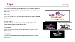
Your logo is an incredibly important part of your brand, and you want it to be reflected consistently along the way. In your guide, you can dictate exactly how to use your logo.
Here, we dictate proper logo use as well as the variations that are acceptable for other color usage in our visual identity guide.
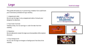
It’s also important to show how not to use the logo. Designers are creative by nature, and it’s important to show them what they’re not supposed to do alongside what they should. You can see these instructions outlined here in our visual identity guide.
That way if there’s an issue, you can refer them to the visual identity guide where it clearly states how the logo can and cannot look.
2. Pick your color palette–and stick with it
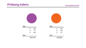
Colors can be easily shifted from designer to designer or program to program. It’s important to give the exact hex code for web use as well as RBG values.
Here you can see we clearly identify our two main colors in our logo. However, we have secondary colors for other graphic design like social media, shown below.
It’s important that we identify all colors that correspond with our brand, so nothing gets changed.
3. Choose fonts that reflect your unique identity
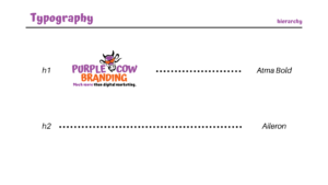
Fonts are a large part of any collateral you produce, and it’s essential to be consistent with your typography throughout in order to look professional. Often, you’ll have many different typefaces, each for a different purpose. In your guide, you can dictate what typeface goes where and how to use it.
Let us help you with your Visual Identity Guide! Contact us at hello@purplecowbranding.com or 972-430-9220.


Recent Comments